[vc_row][vc_column][vc_column_text]
Choosing the right colors for your home interior is a crucial aspect of creating a harmonious and visually appealing living space. The number of colors you incorporate into your home’s interior design depends on various factors, including personal preferences, the size of the space, and the desired atmosphere.
Some homeowners prefer a minimalist approach, opting for a limited color palette to create a sense of simplicity and cohesion. A neutral color scheme, such as whites, grays, and beiges, can make spaces appear larger and serve as a versatile backdrop for furniture and decor.
On the other hand, a more vibrant and eclectic style may involve incorporating a broader spectrum of colors. This approach allows for more creativity and self-expression, but it’s essential to strike a balance to avoid overwhelming the space.
A popular strategy is to use a base color for the walls, such as a calming beige or a versatile gray, and then introduce accent colors for furniture, decor, and smaller details. This creates visual interest without making the space feel too busy.
Consider the concept of a monochromatic color scheme, where different shades and tones of a single color are used throughout the home. This approach provides a cohesive and sophisticated look while offering flexibility in terms of intensity and depth.
For those seeking a bit more variety, a complementary color scheme involves using colors from opposite sides of the color wheel. This adds energy and contrast to the space, creating a dynamic visual impact.
An analogous color scheme, where colors adjacent to each other on the color wheel are used, offers a more subdued and harmonious look. This approach works well for creating a calming and cohesive atmosphere within a room.
In larger homes with open floor plans, maintaining consistency in color schemes between connected spaces helps create a seamless flow. However, this doesn’t mean every room has to be identical; subtle variations in shades and accents can add interest while maintaining overall unity.
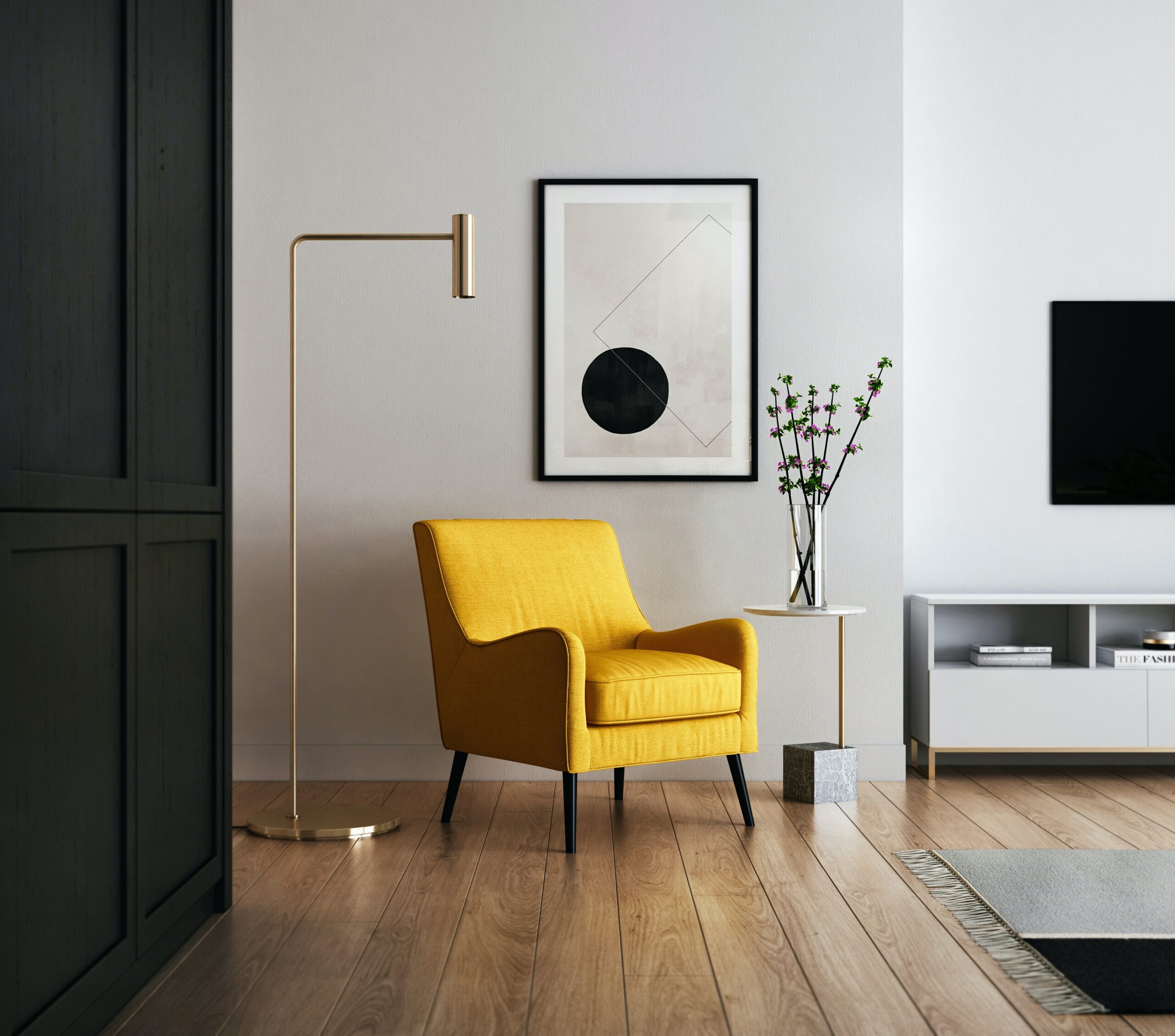
Consider the psychological impact of colors. Warm tones like reds and yellows can create a cozy and inviting atmosphere, while cool tones like blues and greens evoke a sense of calmness and tranquility.
The number of colors in your home can also be influenced by the architectural features and structural elements. Highlighting architectural details with a contrasting color can add character and depth to the overall design.
Texture and pattern play a significant role in how colors are perceived. Even within a limited color palette, introducing varied textures and patterns can add richness and visual appeal to the interiors.
In rooms with abundant natural light, colors may appear differently than in spaces with limited sunlight. Consider how the play of light influences your color choices to achieve the desired effect.
Experiment with different finishes, such as matte, satin, or glossy, to add dimension to your chosen colors. The finish can impact how light interacts with surfaces, affecting the overall ambiance.
Incorporate the concept of the 60-30-10 rule, a widely used guideline in interior design. This rule suggests using 60% of a dominant color, 30% of a secondary color, and 10% of an accent color to achieve a balanced and visually appealing composition.
Take inspiration from your surroundings and personal experiences. Natural elements, travel experiences, or favorite artworks can guide your color choices and infuse a personal touch into your home.
Consider the function of each room when selecting colors. Calming hues may be suitable for bedrooms, while vibrant colors can add energy to social spaces like the living room.
Neutral colors, such as whites and grays, provide a timeless and versatile backdrop. They allow for easy updates to decor and furnishings without the need for a complete color overhaul.
Don’t overlook the impact of color on the perceived size of a room. Lighter colors tend to make spaces feel more open and airy, while darker hues can create a cozy and intimate atmosphere.
For a cohesive look throughout the home, carry a consistent color theme from room to room. This doesn’t mean using the exact same colors but maintaining a sense of visual connection.
Consider the existing elements in your home, such as flooring, fixtures, and cabinetry. Harmonize your color choices with these existing features to create a unified and well-coordinated design.
Using a limited color palette doesn’t mean sacrificing variety. Explore different shades, tones, and intensities within your chosen color family to add depth and nuance to your design.
Take into account the seasonal changes in natural light. A color that looks vibrant in summer might appear different during the muted light of winter. Test samples under various lighting conditions to ensure consistency.
Bold colors can make a statement when used strategically. Consider incorporating a bold accent wall or vibrant furniture piece to add personality without overwhelming the entire space.
Consider the visual weight of different colors. Darker colors tend to carry more visual weight and can be used to anchor a space, while lighter colors create an airy and open feel.
Use color swatches or samples to test how different colors interact in your home. Observing them in the actual lighting conditions of your space helps you make more informed decisions.
The number of colors in your home can also be influenced by cultural or regional preferences. Some cultures embrace vibrant and rich color palettes, while others may prefer more subdued tones.
Keep in mind that trends come and go. While it’s tempting to embrace trendy colors, consider whether they align with your long-term preferences and the overall aesthetic of your home.
Create a cohesive color flow by selecting colors that complement each other. Consider the undertones of your chosen colors to ensure they harmonize well together.
Incorporate natural elements, such as plants or wooden finishes, to add warmth and balance to your color scheme. Natural textures enhance the overall tactile and visual experience of a space.
Experiment with the concept of color blocking, where distinct sections of a wall or room are painted in different colors. This modern approach adds a dynamic and playful element to interiors.
Consider the visual hierarchy of your space. Use color to emphasize focal points or architectural features, guiding the eye through the room in a deliberate manner.
When introducing accent colors, consider using them consistently throughout different rooms. This creates a sense of unity and connection between spaces within your home.
Evaluate the permanence of your color choices. While paint is relatively easy to change, more significant investments like furniture or cabinetry should be selected with a longer-term perspective.
Neutral doesn’t have to mean boring. Explore the wide range of neutral tones, including greiges, taupes, and muted pastels, to achieve a sophisticated and timeless look.
When incorporating multiple colors, pay attention to their undertones. Consistent undertones create a more cohesive and pleasing color scheme.
Consider the emotional impact of color. Warm tones can evoke feelings of comfort and intimacy, while cooler tones promote relaxation and tranquility.
Experiment with the concept of an accent ceiling. While often overlooked, a differently colored ceiling can add a surprising and visually interesting element to a room.
Don’t shy away from using black and white. These classic colors provide a timeless and elegant foundation that pairs well with almost any accent color.
Consider the psychological effects of color on room size. Darker colors can create an illusion of coziness in larger spaces, while lighter colors can open up smaller rooms.
Explore the versatility of earth tones. Browns, greens, and warm terracotta hues can bring a sense of nature indoors, fostering a grounded and calming atmosphere.
The number of colors in your home can also be influenced by architectural features. Highlighting architectural details with contrasting colors can add character and interest.
Experiment with temporary design elements, such as removable wallpaper or accent decor, to test different color schemes before committing to permanent changes.
Consider the color temperature of your chosen hues. Warm colors advance visually, making spaces feel cozier, while cool colors recede, creating a sense of expansiveness.
Balance bold colors with neutral elements to prevent the overall design from becoming overwhelming. Strategic placement of vibrant hues can make a powerful impact.
Layering different textures within your chosen color scheme adds depth and visual interest. Experiment with textiles, finishes, and materials to create a tactile and inviting space.
Use the color wheel as a tool for creating harmonious color schemes. Analogous colors, triadic schemes, and split-complementary palettes offer diverse options for experimentation.
Consider the longevity of your color choices. Opt for timeless colors for larger, more permanent elements and reserve trendier hues for easily updated decor.
When in doubt, consult color professionals or interior designers. Their expertise can provide valuable insights and help you navigate the myriad options available.
Experiment with the juxtaposition of warm and cool colors to create a balanced and inviting atmosphere. The interplay between opposing tones adds complexity to your design.
Personalize your color choices based on the function of each room. Bold and energizing colors may be suitable for active areas, while soothing tones enhance relaxation in bedrooms.
Use mirrors strategically to enhance the impact of your chosen colors. Mirrors reflect light and color, amplifying the visual vibrancy of your selected palette.
Evaluate the natural light conditions in your home. Colors may appear different under various lighting conditions, so observe how they interact with both natural and artificial light.
Consider creating a color story for your home. This involves selecting a cohesive palette that transitions seamlessly from room to room, creating a unified and aesthetically pleasing journey.
Experiment with the 70-20-10 rule for selecting colors. This guideline suggests using a dominant color for 70% of the space, a secondary color for 20%, and an accent color for the remaining 10%.
Balance cool and warm tones to achieve a well-rounded color palette. This prevents spaces from feeling too one-dimensional and contributes to a balanced and inviting atmosphere.
When working with a limited color palette, pay attention to the undertones of each color. Coordinating undertones ensures that even diverse colors work harmoniously together.
Experiment with monochromatic color schemes in different rooms. This creates a sense of continuity while allowing each space to have its unique personality.
Consider the cultural and personal significance of colors. Some colors may hold specific meanings or evoke particular emotions, influencing your overall design narrative.
Embrace the power of contrast. Using light and dark colors strategically enhances the visual interest and focal points within your home.
Experiment with tone-on-tone designs. This involves using different shades of the same color to create a sophisticated and layered look without introducing multiple distinct hues.
Consider the flow of your home’s layout. Coordinating colors between connecting spaces fosters a sense of cohesion and enhances the overall continuity of your design.
Incorporate the principles of color psychology. Understanding how colors impact mood and emotions allows you to create spaces that align with the desired atmosphere.
Experiment with unexpected color combinations. Playful juxtapositions can bring a sense of freshness and innovation to your home’s design.
In rooms with high ceilings, consider using darker colors to visually lower the ceiling height. This creates a more intimate and grounded feel within the space.
Experiment with bold patterns and prints within your chosen color scheme. This adds an extra layer of visual interest and personality to your home’s interiors.
Consider the visual weight of furniture and decor items. Darker or bolder colors may be reserved for larger, anchor pieces, while lighter hues can be used for accents.
Test paint samples on different walls and at various times of the day. This ensures that you experience how the color interacts with changing light conditions.
Incorporate personal artwork or photography into your home’s design. The colors within these pieces can serve as inspiration for your overall color palette.
Consider the impact of ceiling colors on the overall design. While white ceilings are traditional, experimenting with alternative hues can add a distinctive touch.
Investigate the latest color trends for inspiration. While not the sole factor in decision-making, trends can offer contemporary ideas and perspectives for your home design.
Experiment with color-blocking techniques on walls or furniture. This involves using contrasting or complementary colors in geometric patterns to create a visually dynamic effect.
Consider creating an accent wall using a bold or contrasting color. This focal point can add drama and interest to a room without overwhelming the entire space.
Evaluate the color continuity between indoor and outdoor spaces. Coordinating color palettes create a seamless transition, especially in homes with outdoor access.
Experiment with temporary design elements, such as removable wallpaper or accent decor, to test different color schemes before committing to permanent changes.
Consider the color temperature of your chosen hues. Warm colors advance visually, making spaces feel cozier, while cool colors recede, creating a sense of expansiveness.
Balance bold colors with neutral elements to prevent the overall design from becoming overwhelming. Strategic placement of vibrant hues can make a powerful impact.
Layering different textures within your chosen color scheme adds depth and visual interest. Experiment with textiles, finishes, and materials to create a tactile and inviting space.
Use the color wheel as a tool for creating harmonious color schemes. Analogous colors, triadic schemes, and split-complementary palettes offer diverse options for experimentation.
Consider the longevity of your color choices. Opt for timeless colors for larger, more permanent elements and reserve trendier hues for easily updated decor.
When in doubt, consult color professionals or interior designers. Their expertise can provide valuable insights and help you navigate the myriad options available.
Experiment with the juxtaposition of warm and cool colors to create a balanced and inviting atmosphere. The interplay between opposing tones adds complexity to your design.
Personalize your color choices based on the function of each room. Bold and energizing colors may be suitable for active areas, while soothing tones enhance relaxation in bedrooms.
Use mirrors strategically to enhance the impact of your chosen colors. Mirrors reflect light and color, amplifying the visual vibrancy of your selected palette.
Evaluate the natural light conditions in your home. Colors may appear different under various lighting conditions, so observe how they interact with both natural and artificial light.
Consider creating a color story for your home. This involves selecting a cohesive palette that transitions seamlessly from room to room, creating a unified and aesthetically pleasing journey.
Experiment with the 70-20-10 rule for selecting colors. This guideline suggests using a dominant color for 70% of the space, a secondary color for 20%, and an accent color for the remaining 10%.
Balance cool and warm tones to achieve a well-rounded color palette. This prevents spaces from feeling too one-dimensional and contributes to a balanced and inviting atmosphere.
When working with a limited color palette, pay attention to the undertones of each color. Coordinating undertones ensures that even diverse colors work harmoniously together.
Experiment with monochromatic color schemes in different rooms. This creates a sense of continuity while allowing each space to have its unique personality.
Consider the cultural and personal significance of colors. Some colors may hold specific meanings or evoke particular emotions, influencing your overall design narrative.
Embrace the power of contrast. Using light and dark colors strategically enhances the visual interest and focal points within your home.
Experiment with tone-on-tone designs. This involves using different shades of the same color to create a sophisticated and layered look without introducing multiple distinct hues.
Consider the flow of your home’s layout. Coordinating colors between connecting spaces fosters a sense of cohesion and enhances the overall continuity of your design.
[/vc_column_text][vc_empty_space][vc_gallery type=”image_grid” images=”10876,10873,10869,10866,10863,10860,10854,10851,10825,10822,10813,10780,10703,10696,10694,10714,10712,10630,10626,10606,10609″ img_size=”300×300″][vc_empty_space][vc_column_text]Useful links | Interior Design | Interior Design company in Delhi NCR | Interior Design Cost in Gurgaon | Low budget interior designer in Gurgaon | Interior Design Firm | Interior Designer Ideas | Interior Designer in Noida Extension | Interior A to Z | Interior Designer in Gurgaon[/vc_column_text][vc_empty_space][vc_empty_space][vc_pinterest][vc_empty_space][vc_empty_space][vc_tweetmeme][vc_empty_space][/vc_column][/vc_row]