[vc_row][vc_column][vc_column_text]
Choosing a house color goes beyond mere aesthetics; it’s about creating a space that radiates positive energy, prosperity, and good fortune. While notions of luck are subjective, certain colors have been associated with positive vibes and prosperity across various cultures. Let’s embark on a journey through the spectrum to discover the colors believed to bring luck to your home.
1. Red, the Universal Symbol: Red stands as a universal symbol of luck and prosperity in many cultures. It is thought to invite good fortune and positive energy into a home.
2. Fiery Energetic Hues: Warm and fiery hues, like shades of red and orange, are believed to activate the chi or life force energy, fostering an environment of positivity.
3. Chinese Feng Shui Wisdom: In Chinese Feng Shui, red is considered auspicious. It symbolizes happiness, success, and good luck, making it a popular choice for front doors.
4. Vibrant Front Door Impact: A vibrant front door, especially in shades of red, is believed to attract good fortune and positive opportunities into your life.
5. Bold Accents of Wealth: Using bold accents of red or deep maroon in interior spaces, particularly in areas associated with wealth like the southeast, is thought to invite financial prosperity.
6. Blue, the Color of Tranquility: Blue, a color associated with calmness and tranquility, is believed to bring serenity and peace, creating an environment conducive to good fortune.
7. Sky-Blue Optimism: Sky-blue hues are often associated with optimism and a positive outlook, making them a favorable choice for spaces where inspiration and creativity thrive.
8. Harmonious Green Abundance: Green, symbolizing growth and abundance, is believed to attract wealth and prosperity. It’s associated with the abundance of nature and a harmonious living environment.
9. Freshness of Nature: Incorporating various shades of green into your home design can bring the freshness of nature indoors, promoting a sense of well-being and good luck.
10. Chinese Jade Symbolism: In Chinese culture, green, particularly jade green, is considered a symbol of good luck, harmony, and prosperity.
11. Golden Touch of Opulence: Golden hues are often associated with opulence and wealth. Using gold accents or incorporating shades of gold in your decor is believed to invite financial success.
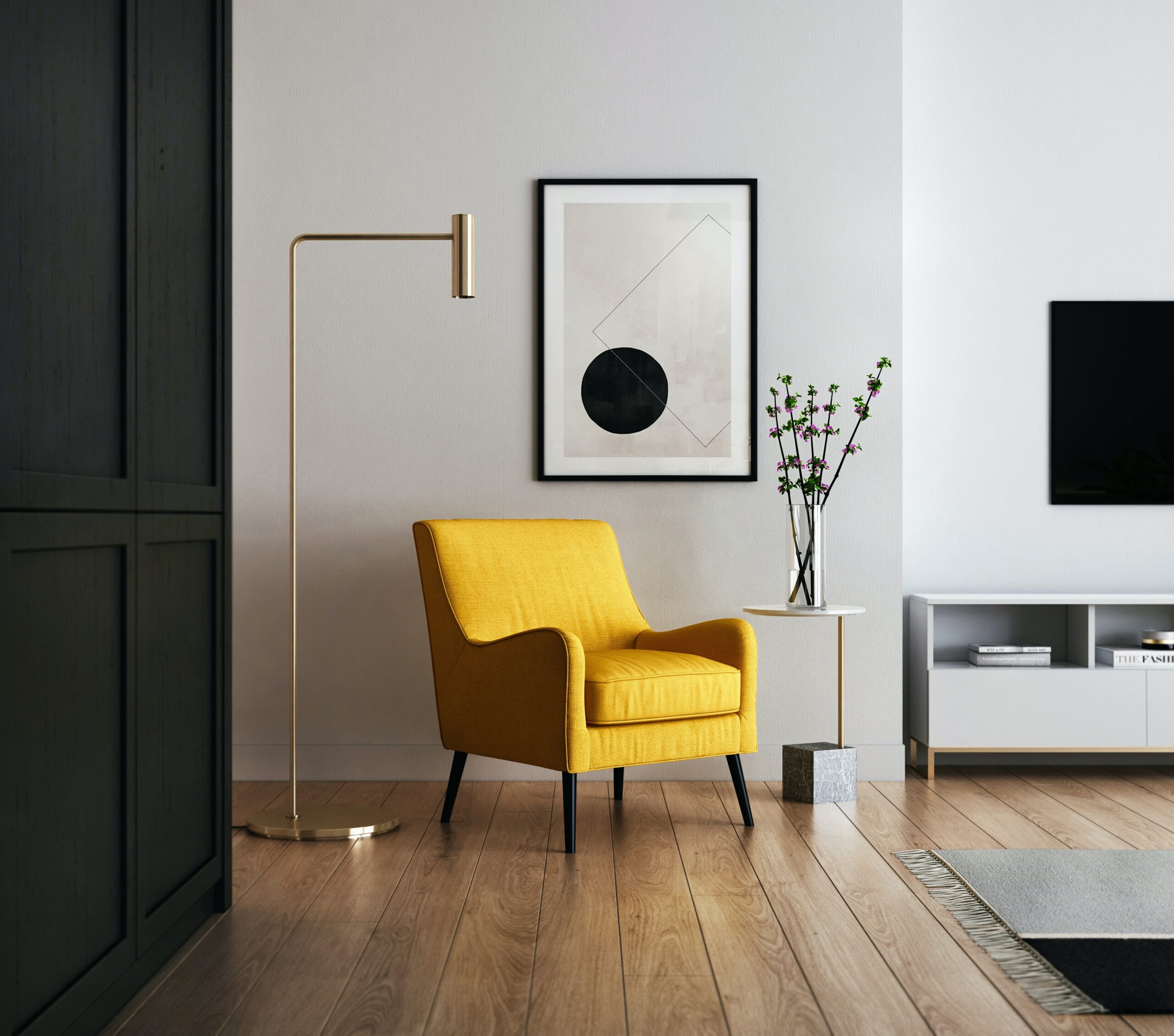
12. Sunshine Yellow Cheer: Yellow, resembling the warmth of sunshine, is associated with joy and happiness. It is believed to bring positive energy and a cheerful atmosphere.
13. South-Facing Yellow Vibes: In Feng Shui, yellow is considered auspicious, especially in south-facing homes. It is thought to enhance fame and recognition.
14. Purple Royalty and Prosperity: Purple, historically associated with royalty, is also linked to prosperity. Deep shades of purple are believed to attract wealth and success.
15. Lavender Tranquility: Lighter shades of purple, such as lavender, symbolize tranquility. They are thought to create a calm and peaceful atmosphere, conducive to good luck.
16. Earthy Brown Stability: Earthy tones like brown are associated with stability and grounding. They are believed to provide a strong foundation for success and prosperity.
17. Wooden Accents for Balance: Incorporating wooden accents, which often have brown tones, is believed to bring a sense of balance and stability to a space.
18. White Purity and Clarity: White, symbolizing purity and clarity, is believed to create an atmosphere of cleanliness and positive energy. It is often associated with new beginnings.
19. Gold and White Harmony: The combination of gold and white is thought to symbolize harmony, prosperity, and success. It is often used in Feng Shui to attract positive energy.
20. Gray for Sophistication: Gray, associated with sophistication and balance, is believed to promote a stable and composed environment, conducive to good fortune.
21. Black for Protection: While black is often associated with mystery, in Feng Shui, it is considered a protective color. It is believed to absorb negative energy and provide a sense of security.
22. Yin and Yang Balance: A harmonious balance of yin and yang colors, such as black and white, is believed to create equilibrium and attract positive energy.
23. Coral for Warmth: Coral, a warm and vibrant hue, is associated with enthusiasm and energy. It is believed to bring a sense of warmth and positivity.
24. Pink for Love and Harmony: Pink, often associated with love and harmony, is believed to create a gentle and nurturing atmosphere. It is considered auspicious for relationships.
25. Terracotta Grounding Energy: Terracotta, with its earthy tones, is believed to ground energy and create a stable foundation. It is associated with balance and strength.
26. Silver for Reflection: Silver, resembling the reflective qualities of mirrors, is believed to amplify positive energy. It is often used to enhance the flow of chi in a space.
27. Soft Pastels for Calmness: Soft pastel hues, like light blues and greens, are associated with calmness and tranquility. They create a serene environment conducive to positive energy.
28. Bold Red Accents for Power: Introducing bold red accents, even in small doses, is thought to infuse a space with power, vitality, and good luck.
29. Coral Reds for Passion: Coral reds, with a touch of orange, are associated with passion and enthusiasm. They are believed to bring vibrancy and positive energy.
30. Green for Health and Prosperity: Green, particularly in health-related areas of the home, is believed to attract good health and prosperity. It symbolizes the vitality of nature.
31. Oceanic Blues for Flow: Oceanic blues, reminiscent of tranquil waters, are associated with the flow of positive energy. They create a sense of calm and harmony.
32. Harmonious Earth Tones: Harmonizing earth tones, including greens and browns, are believed to create a connection with nature and promote a sense of balance.
33. Rose Gold Elegance: Rose gold, a blend of pink and gold, is associated with elegance and luxury. It is believed to invite refined energy and good fortune.
34. Copper Accents for Energy Flow: Incorporating copper accents, resembling earthy tones, is believed to enhance the flow of energy and promote balance in a space.
35. Coral Pinks for Vitality: Coral pinks, reminiscent of tropical hues, are associated with vitality and positive energy. They bring a sense of freshness to a space.
36. Sage Greens for Harmony: Sage greens, with their muted tones, are believed to create harmony and balance. They are ideal for spaces where a sense of tranquility is desired.
37. Lemon Yellow for Energy: Lemon yellow, a vibrant shade, is believed to bring energy and positivity. It is associated with a sunny and optimistic outlook.
38. Turquoise for Clarity: Turquoise, with its calming and refreshing qualities, is believed to bring clarity of thought and positive communication.
39. Coral Reds for Warmth: Coral reds, resembling the warmth of the sun, are associated with energy and passion. They create a vibrant and uplifting atmosphere.
40. Mustard Yellow for Optimism: Mustard yellow, a warm and deep hue, is believed to evoke optimism and a sense of well-being. It adds a touch of richness to a space.
41. Brick Reds for Grounding: Brick reds, reminiscent of earthy tones, are believed to ground energy and create a stable foundation for success.
42. Mint Greens for Refreshment: Mint greens, with their refreshing qualities, are associated with renewal and revitalization. They bring a sense of freshness to a space.
43. Coral Pinks for Warmth: Coral pinks, resembling the glow of a sunset, are associated with warmth and positivity. They create a cozy and inviting atmosphere.
44. Charcoal Greys for Sophistication: Charcoal greys, with their deep tones, are believed to evoke sophistication and a sense of mystery. They create a backdrop for vibrant energies.
45. Lavender for Tranquil Bedrooms: Lavender, with its calming properties, is believed to promote tranquility in bedrooms. It is associated with restful sleep and peaceful energy.
46. Aqua Blues for Clarity: Aqua blues, reminiscent of clear waters, are believed to bring clarity and a sense of calm. They are ideal for spaces where focus is essential.
47. Coral Pinks for Affection: Coral pinks, symbolizing affection, are associated with love and positive relationships. They create a warm and loving atmosphere.
48. Olive Greens for Balance: Olive greens, resembling the serenity of nature, are believed to bring balance and a connection to the outdoors.
49. Soft Pastels for Nursery Charm: Soft pastels, including gentle pinks and blues, are often chosen for nurseries. They create a soothing and charming environment for newborns.
50. Mustard Yellow for Playfulness: Mustard yellow, a playful and energetic hue, is associated with a positive and vibrant atmosphere. It brings a touch of sunshine to a space.
51. Brick Reds for Courage: Brick reds, resembling earthy tones, are believed to instill courage and strength. They are associated with grounded and empowering energy.
52. Coral Blues for Coastal Vibes: Coral blues, reminiscent of beachside hues, are believed to bring coastal vibes and a sense of relaxation. They create a breezy and carefree atmosphere.
53. Rust Reds for Warmth: Rust reds, with their warm undertones, are associated with warmth and comfort. They create a cozy and inviting ambiance.
54. Charcoal Greys for Modern Elegance: Charcoal greys, often chosen for modern interiors, are believed to evoke elegance and sophistication. They serve as a backdrop for sleek and stylish decor.
55. Dusty Pinks for Sophistication: Dusty pinks, with their muted tones, are associated with sophistication and elegance. They bring a touch of refinement to a space.
56. Olive Greens for Peace: Olive greens, symbolizing peace, are believed to create a serene and calming environment. They foster a sense of tranquility.
57. Coral Pinks for Positivity: Coral pinks, reminiscent of blooming flowers, are associated with positivity and joy. They bring a burst of vibrant energy to a space.
58. Terracotta Reds for Coziness: Terracotta reds, resembling earthy tones, are believed to create a cozy and grounded atmosphere. They bring warmth and comfort to a space.
59. Pale Blues for Serenity: Pale blues, with their calming qualities, are associated with serenity and peace. They create a tranquil backdrop for relaxation.
60. Coral Blues for Nautical Inspiration: Coral blues, reminiscent of nautical themes, are believed to bring a sense of adventure and exploration. They create a maritime-inspired atmosphere.
61. Sage Greens for Well-Being: Sage greens, symbolizing well-being, are believed to create a space that fosters physical and mental health. They bring a sense of balance.
62. Coral Pinks for Playfulness: Coral pinks, resembling the vibrancy of blossoming flowers, are associated with playfulness and positive energy. They bring a sense of joy to a space.
63. Mustard Yellow for Enlightenment: Mustard yellow, with its warm and golden tones, is believed to bring enlightenment and positive energy. It creates a welcoming and optimistic atmosphere.
64. Brick Reds for Vitality: Brick reds, symbolizing the earthy richness of clay, are believed to bring vitality and grounded energy. They create a sense of strength and stability.
65. Coral Reds for Celebration: Coral reds, resembling festive hues, are associated with celebration and joy. They create a lively and vibrant atmosphere for gatherings.
[/vc_column_text][vc_empty_space][vc_gallery type=”image_grid” images=”10876,10873,10869,10866,10863,10860,10854,10851,10825,10822,10813,10780,10703,10696,10694,10714,10712,10630,10626,10606,10609″ img_size=”300×300″][vc_empty_space][vc_column_text]Useful links | Interior Design | Interior Design company in Delhi NCR | Interior Design Cost in Gurgaon | Low budget interior designer in Gurgaon | Interior Design Firm | Interior Designer Ideas | Interior Designer in Noida Extension | Interior A to Z | Interior Designer in Gurgaon[/vc_column_text][vc_empty_space][vc_empty_space][vc_pinterest][vc_empty_space][vc_empty_space][vc_tweetmeme][vc_empty_space][/vc_column][/vc_row]