[vc_row][vc_column][vc_column_text]
Intro: In the world of interior design, color is a powerful tool that transcends mere aesthetics; it’s a language that speaks to emotions, influences perceptions, and shapes the ambiance of a space. Let’s embark on a journey through the intricacies of color in interior design, exploring its significance, psychological impact, and the artful ways designers wield this palette to craft inspiring environments.
- Color as a Design Element: Color is one of the fundamental elements of design, alongside form, line, texture, and space.
- Visual Impact: The visual impact of a space is often the first impression, and color plays a pivotal role in shaping this initial perception.
- Mood and Atmosphere: Color has the unparalleled ability to evoke emotions and set the mood and atmosphere of a room.
- Warm and Cool Tones: Colors are often categorized into warm (reds, oranges, yellows) and cool (blues, greens, purples) tones, each eliciting distinct emotional responses.
- Personal Preferences: Color choices in interior design are highly subjective, reflecting personal preferences, cultural influences, and individual experiences.
- Cultural Significance: Colors hold cultural significance, symbolizing different meanings across various societies and traditions.
- Color Wheel Basics: Understanding the color wheel, which consists of primary, secondary, and tertiary colors, is fundamental for designers.
- Complementary Colors: Complementary colors, positioned opposite each other on the color wheel, create dynamic and vibrant contrasts.
- Analogous Colors: Analogous colors, found side by side on the color wheel, create harmonious and serene color schemes.
- Monochromatic Palettes: Monochromatic palettes involve using variations of a single color, creating a cohesive and sophisticated look.
- Triadic Color Schemes: Triadic color schemes involve using three colors equidistant from each other on the color wheel for balanced compositions.
- Split-Complementary Schemes: A split-complementary scheme involves a base color and two adjacent to its complementary color, offering a balanced yet dynamic palette.
- Tetradic Color Schemes: Tetradic schemes use two complementary color pairs, offering a rich and varied color palette.
- Psychological Impact: Colors have psychological implications, influencing emotions, energy levels, and overall well-being.
- Red: Red is associated with passion, warmth, and energy, making it a popular choice for accent pieces or feature walls.
- Blue: Blue conveys calmness, serenity, and stability, making it a prevalent choice for bedrooms and living spaces.
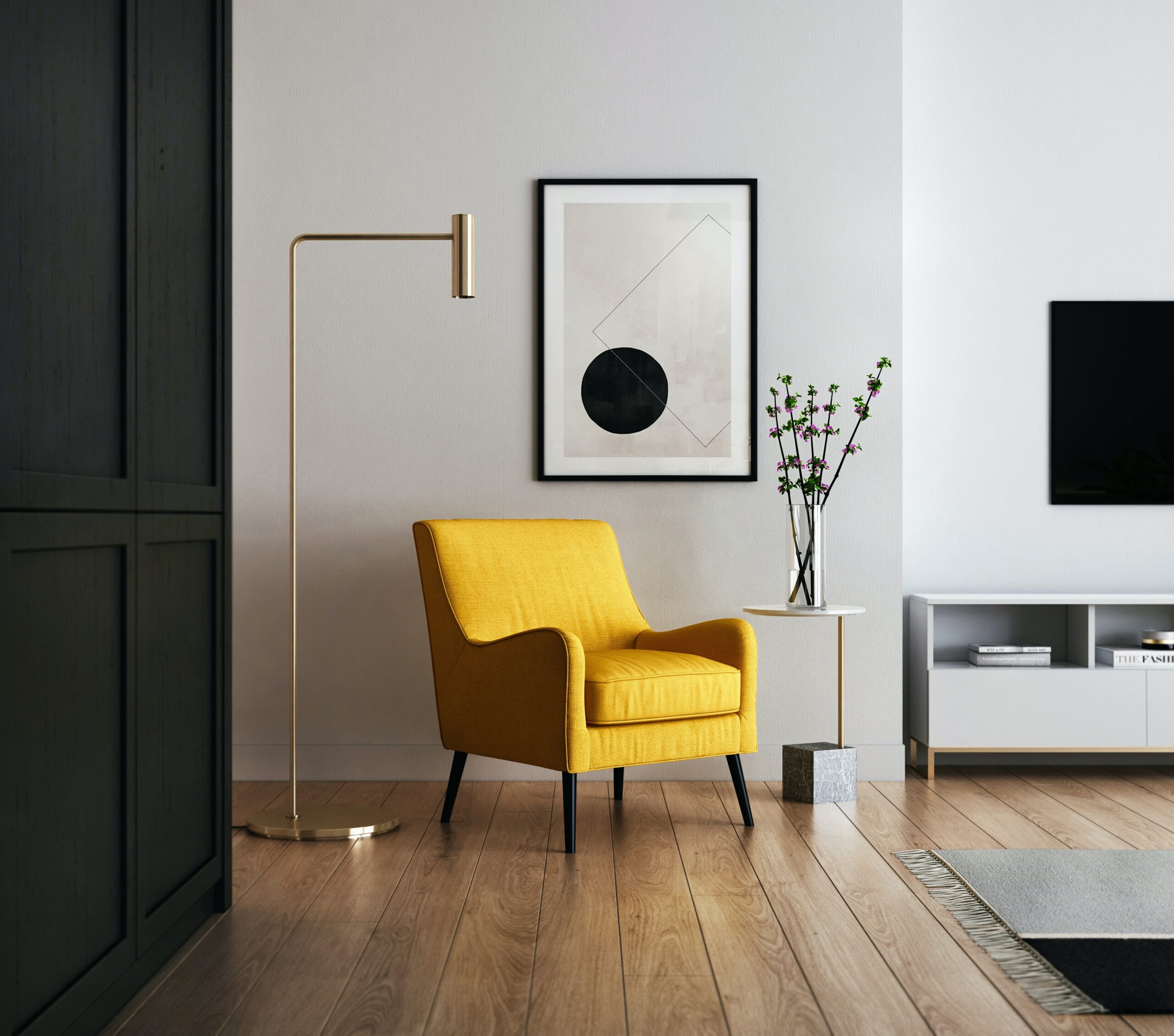
- Yellow: Yellow is synonymous with optimism, happiness, and energy, bringing vibrancy to spaces.
- Green: Green is linked to nature, growth, and tranquility, making it an ideal choice for creating serene environments.
- Purple: Purple exudes luxury, sophistication, and creativity, often used in accent pieces or lush furnishings.
- Orange: Orange radiates warmth, enthusiasm, and energy, adding a lively touch to interiors.
- Neutral Colors: Neutral colors like whites, grays, and beige serve as versatile backdrops, allowing other colors to shine.
- White: White symbolizes purity, cleanliness, and simplicity, creating a sense of openness and airiness.
- Gray: Gray is a timeless and versatile neutral, conveying sophistication and balance.
- Black: Black embodies elegance, formality, and a touch of drama, often used for contrast or accent.
- Brown: Brown, associated with earthiness, warmth, and stability, is a grounding and inviting choice.
- Color in Small Spaces: In smaller spaces, light and neutral colors can create an illusion of openness and brightness.
- Accent Colors: Accent colors are used strategically to draw attention to specific elements or areas within a room.
- Feature Walls: Feature walls, painted or adorned with a standout color or pattern, serve as focal points in interior design.
- Color Psychology in Design: Understanding color psychology allows designers to intentionally create environments that evoke desired emotions.
- Cool vs. Warm Color Preferences: Individuals may gravitate towards cool or warm colors based on personal preferences and the desired ambiance.
- Seasonal Influences: Seasonal changes can inspire color choices, with spring tones evoking freshness and winter hues creating coziness.
- Natural Elements: Incorporating colors inspired by nature, such as earthy browns and leafy greens, connects interiors with the outdoors.
- Color in Lighting Design: Lighting design interacts with color, influencing how colors appear and enhancing the overall atmosphere.
- High Contrast Designs: High-contrast designs, utilizing bold color combinations, create a dynamic and visually striking impact.
- Low Contrast Designs: Low-contrast designs, featuring subtle color variations, contribute to a softer and more cohesive aesthetic.
- Pattern and Color Coordination: Coordinating colors within patterns is crucial for maintaining balance and avoiding visual overload.
- Color Flow: Achieving a harmonious color flow throughout interconnected spaces promotes a cohesive design narrative.
- Color in Different Rooms: Each room’s function and purpose can guide color choices, with tranquil colors for bedrooms and energizing tones for kitchens.
- Cohesive Color Schemes: Maintaining a cohesive color scheme throughout a home fosters a sense of unity and continuity.
- Experimenting with Temporary Colors: Temporary colors, such as removable wallpaper or easily changeable accessories, enable experimentation without long-term commitment.
- Color Trends: Staying aware of color trends allows designers to infuse contemporary elements while maintaining timeless appeal.
- Revitalizing with Color: A fresh coat of paint or updated color scheme can revitalize and modernize existing spaces.
- Importance of Natural Light: Natural light enhances the visibility and vibrancy of colors, influencing their perceived intensity.
- Color in Personal Spaces: Consider personal preferences and the intended use of a space when selecting colors for private areas like bedrooms.
- Cultural Influences on Color: Colors carry cultural meanings; designers must be mindful of cultural nuances when working on international projects.
- Budget-Friendly Color Updates: Incorporating color updates need not be expensive; small changes, like new throw pillows or wall art, can make a significant impact.
- The Impact of Color Temperature: Warm and cool color temperatures affect the perceived warmth or coolness of a space, influencing comfort levels.
- Creating Balance with Neutrals: Neutral colors, when used judiciously, create balance and prevent overwhelming visual stimulation.
- Using Color to Define Spaces: Distinct colors can define various zones within an open-plan layout, aiding in spatial organization.
- Color Psychology in Commercial Spaces: Commercial spaces leverage color psychology to influence consumer behavior, encourage longer stays, or convey brand identity.
- Biophilic Design and Color: Biophilic design, incorporating natural elements, often involves earthy colors to enhance the connection to nature.
- Consideration for Accessibility: Designers must consider color accessibility, ensuring spaces are welcoming and inclusive for individuals with visual impairments.
- Paint Finishes: The choice of paint finish influences the way colors interact with light, with matte finishes absorbing more light and glossy finishes reflecting it.
- Color Testing: Before committing to a full paint job, testing colors in small sections helps assess how they appear in different lighting conditions.
- Color Consultations: Engaging in color consultations with clients allows designers to align their vision with the client’s preferences and needs.
- Color Balance with Textiles: Incorporating colorful textiles, such as rugs and curtains, balances color distribution and adds texture to a space.
- Global Color Trends: Color trends vary globally, influenced by cultural events, societal shifts, and technological advancements.
- Personalizing Neutral Spaces: Even neutral spaces can be personalized by introducing pops of color through accessories or accent furniture.
- Contrast in Monochromatic Designs: Monochromatic designs can benefit from contrast in shades and tones to prevent monotony.
- Color Harmony in Furniture Selection: Harmonizing the colors of furniture with the overall color scheme enhances visual cohesion.
- Vintage and Retro Color Palettes: Vintage and retro color palettes evoke nostalgia, with mid-century modern hues making a resurgence in contemporary design.
- Reviving Tradition with Color: Traditional color schemes, when modernized with fresh interpretations, can breathe new life into classic designs.
- Cohesive Exterior and Interior Colors: Harmony between exterior and interior color schemes creates a seamless transition and enhances curb appeal.
- Color Psychology in Retail Design: Retail spaces strategically employ colors to influence customer behavior, drive sales, and enhance the shopping experience.
- Personal Connection to Color: Individuals often have personal connections to specific colors, evoking memories or emotions tied to those hues.
- Color in Healing Spaces: In healthcare design, soothing and calming colors are chosen to create healing environments that promote well-being.
- Impact of Artificial Lighting: Artificial lighting can alter the appearance of colors; designers must consider both natural and artificial light sources.
- Color Maintenance: Consider the ease of color maintenance, especially in high-traffic areas prone to wear and tear.
- Experimental Color Blocking: Bold color blocking techniques can add a playful and contemporary touch to interiors.
- Individual Response to Color: The way individuals respond to colors varies, influenced by personal experiences, memories, and cultural backgrounds.
- Customizing Color Schemes: Customized color schemes allow designers to tailor spaces to the unique personalities and preferences of clients.
- Impact of Color in Hospitality Design: Hospitality spaces utilize color to create memorable experiences, establish brand identity, and influence guest perceptions.
- Psychological Comfort in Bedrooms: Bedroom colors should promote psychological comfort, with calming tones contributing to restful sleep.
- Color Trends in Technology: Incorporating technology-inspired color trends, such as tech blues and cyber yellows, reflects the influence of digital culture.
- Historical Color Palettes: Drawing inspiration from historical color palettes adds a timeless and sophisticated touch to interiors.
- Bold Color Experiments: Brave designers may experiment with bold and unconventional color choices, pushing the boundaries of traditional design.
- Seasonal Color Rotations: Rotating color schemes with seasons allows for dynamic and ever-changing interiors.
- Color Impact on Perception of Space: Strategically using light and dark colors can influence the perception of space, making rooms appear larger or cozier.
- Unexpected Color Combinations: Exploring unexpected color combinations can yield surprisingly delightful results, showcasing the designer’s creativity.
- Color Maintenance in Commercial Spaces: Commercial spaces with heavy foot traffic must consider color durability and ease of maintenance.
- Dramatic Entrances: Making a statement with bold colors in entryways sets the tone for the entire interior experience.
- Colorful Ceilings: Introducing color on ceilings adds visual interest and dimension to a space, breaking away from traditional white.
- Seasonal Color Transitions: Transitioning between seasonal color palettes ensures that interiors stay fresh and relevant.
- Color in Open-Concept Layouts: In open-concept layouts, maintaining color harmony is essential for visual coherence between different zones.
- Monochromatic Sophistication: Monochromatic designs, when executed with sophistication, exude timeless elegance.
- Colorful Backsplashes: In kitchens and bathrooms, colorful backsplashes inject vibrancy into functional spaces.
- Colorful Window Treatments: Bold and colorful window treatments serve as focal points, framing outdoor views while adding personality.
- Cohesive Color Storytelling: Creating a cohesive color story throughout a space tells a narrative and establishes a unified design language.
- Eclectic Color Mixes: Eclectic interiors thrive on diverse color mixes, embracing variety and unconventional pairings.
- Color in Educational Spaces: Educational spaces use color to enhance learning environments, promote focus, and create stimulating atmospheres.
- Cultural Adaptations in Color Choices: Designers working in diverse cultural contexts adapt color choices to align with local preferences and sensibilities.
- Timeless Neutrals: Neutrals, when chosen with intention, stand the test of time and provide a versatile backdrop for evolving design trends.
- Color Harmony in Multipurpose Spaces: In multipurpose spaces, achieving color harmony ensures that diverse activities coexist seamlessly.
- Color in Art Selection: Artwork selection complements and enhances color schemes, contributing to the overall visual narrative.
- Colorful Kids’ Spaces: Kids’ spaces often embrace vibrant colors, fostering creativity and a lively atmosphere.
- Creating Focal Points: Strategically placing bursts of color creates focal points, guiding the eye and adding interest to specific areas.
- Restraint in Color Usage: Exercising restraint in color usage prevents visual overload, allowing key elements to shine.
- Adapting Color to Architectural Features: Working with architectural features, designers integrate color to highlight or downplay specific elements.
- Personal Expression in Color Choices: Ultimately, color in interior design is a form of personal expression, allowing individuals to curate spaces that resonate with their unique tastes, preferences, and emotions.
Conclusion: Color in interior design is a kaleidoscopic journey, offering endless possibilities for creative expression and emotional resonance. From the nuanced choices of warm and cool tones to the strategic play of complementary and analogous schemes, designers wield the palette with mastery. As color continues to shape the ever-evolving landscapes of homes, offices, and public spaces, it remains a dynamic force, breathing life and character into the canvases of our daily lives.
[/vc_column_text][vc_empty_space][vc_gallery type=”image_grid” images=”10876,10873,10869,10866,10863,10860,10854,10851,10825,10822,10813,10780,10703,10696,10694,10714,10712,10630,10626,10606,10609″ img_size=”300×300″][vc_empty_space][vc_column_text]Useful links | Interior Design | Interior Design company in Delhi NCR | Interior Design Cost in Gurgaon | Low budget interior designer in Gurgaon | Interior Design Firm | Interior Designer Ideas | Interior Designer in Noida Extension | Interior A to Z | Interior Designer in Gurgaon[/vc_column_text][vc_empty_space][vc_empty_space][vc_pinterest][vc_empty_space][vc_empty_space][vc_tweetmeme][vc_empty_space][/vc_column][/vc_row]