[vc_row][vc_column][vc_column_text]
Choosing the right colors to decorate a room is like selecting the palette for a beautiful canvas. It sets the tone, influences mood, and transforms the space into a personalized haven. Here’s a comprehensive guide on how to navigate the color spectrum and bring your vision to life.
1. Consider the Room’s Purpose: Start by considering the purpose of the room. Is it a vibrant living room, a tranquil bedroom, or a productive home office? Different activities call for different color schemes.
2. Embrace the Power of Neutrals: Neutrals form a versatile foundation. Whites, grays, and beiges create a timeless backdrop, allowing you to experiment with pops of color in furnishings and accessories.
3. Explore Color Psychology: Delve into color psychology to understand the emotions associated with each hue. Blues evoke calmness, reds energize, yellows bring warmth, and greens signify nature. Choose colors that align with the desired atmosphere.
4. Play with Light and Dark Tones: Experiment with light and dark tones to add depth. Lighter colors make a space feel larger, while darker hues bring coziness and intimacy.
5. Create a Color Flow: Establish a color flow between connected rooms. Harmonize the palette, ensuring a seamless transition from one space to another. This creates a cohesive and visually appealing home.
6. Use the 60-30-10 Rule: Follow the 60-30-10 rule for a balanced color scheme. Choose a dominant color (60%), a secondary color (30%), and an accent color (10%) to distribute visual weight evenly.
7. Harmonize with Existing Elements: Consider existing elements like furniture, flooring, and architectural features. Harmonize your color choices with these elements rather than working against them.
8. Test Samples in Natural Light: Always test paint samples in the room’s natural light. Colors can appear different under various lighting conditions, so observe them at different times of the day.
9. Play with Warm and Cool Tones: Understand the distinction between warm and cool tones. Warm tones (reds, yellows) add energy, while cool tones (blues, greens) bring a calming effect. Balance them based on the room’s purpose.
10. Opt for Timeless Hues: For longevity, opt for timeless hues. Whites, grays, and muted pastels endure changing trends, providing a versatile canvas for evolving styles.
11. Consider the Size of the Room: The size of the room influences color choices. Light colors open up smaller spaces, while darker shades can create an intimate ambiance in larger rooms.
12. Don’t Overlook the Ceiling: The ceiling is often overlooked but plays a crucial role. Consider lighter hues to visually lift the ceiling, creating a sense of height.
13. Monochromatic Elegance: Monochromatic color schemes, using variations of a single color, exude elegance. Experiment with different shades and tones for a sophisticated look.
14. Complementary Color Dynamics: Explore complementary colors for dynamic contrast. Pairing opposites on the color wheel, like blue and orange or purple and yellow, creates vibrant and eye-catching combinations.
15. Analogous Harmony: Analogous colors, situated next to each other on the color wheel, create harmonious schemes. This approach is especially pleasing to the eye and offers a unified aesthetic.
16. Triadic Balance: For a balanced yet colorful approach, choose a triadic color scheme by selecting three equidistant hues on the color wheel. This adds variety without overwhelming the senses.
17. Tonal Variations: Introduce tonal variations within a color family. Lighter and darker shades of the same color add interest without deviating too far from the chosen palette.
18. Pastels for Serenity: Pastel hues bring a sense of serenity and softness. Consider muted pinks, blues, or greens for a calming and delightful atmosphere.
19. Bold Accents for Drama: Inject drama with bold accent colors. Even in predominantly neutral spaces, a splash of vibrant red, emerald green, or royal blue can create focal points.
20. Earthy Tones for Warmth: Embrace earthy tones for warmth and grounding. Terracottas, browns, and olive greens connect the interior to nature, fostering a cozy and inviting feel.
21. Stay True to Personal Style: Let your personal style shine through. If you’re drawn to a particular color, incorporate it in a way that complements the overall design while reflecting your taste.
22. Draw Inspiration from Art: Artwork can be a fantastic source of color inspiration. Pull hues from a favorite painting or sculpture to guide your color choices.
23. Be Mindful of Trends: While trends can be inspiring, be mindful of their transience. Choose trendy colors for elements that are easy to update, such as accessories and textiles.
24. Visualize with Mood Boards: Create mood boards to visualize color combinations. Collect swatches, fabric samples, and images to see how colors interact and evoke the desired mood.
25. Take Risks in Small Doses: If you’re drawn to bold colors but hesitate to commit, start small. Experiment with an accent wall, colorful furniture, or vibrant accessories to test the waters.
26. Create a Tranquil Retreat with Blues: Blues, ranging from serene sky hues to deep navy, create tranquil retreats. Ideal for bedrooms and bathrooms, they evoke a sense of calm and relaxation.
27. Energetic Reds for Social Spaces: Reds and warm tones are ideal for social spaces. Consider using them in dining rooms or living areas to stimulate conversation and energy.
28. Gentle Greens for Nature-Inspired Spaces: Greens, especially soft and muted shades, bring a touch of nature indoors. Ideal for bedrooms or reading nooks, they promote relaxation and a connection to the outdoors.
29. Soothing Lavenders for Bedrooms: Lavenders and purples add a soothing touch to bedrooms. These hues are associated with tranquility and can create a restful ambiance.
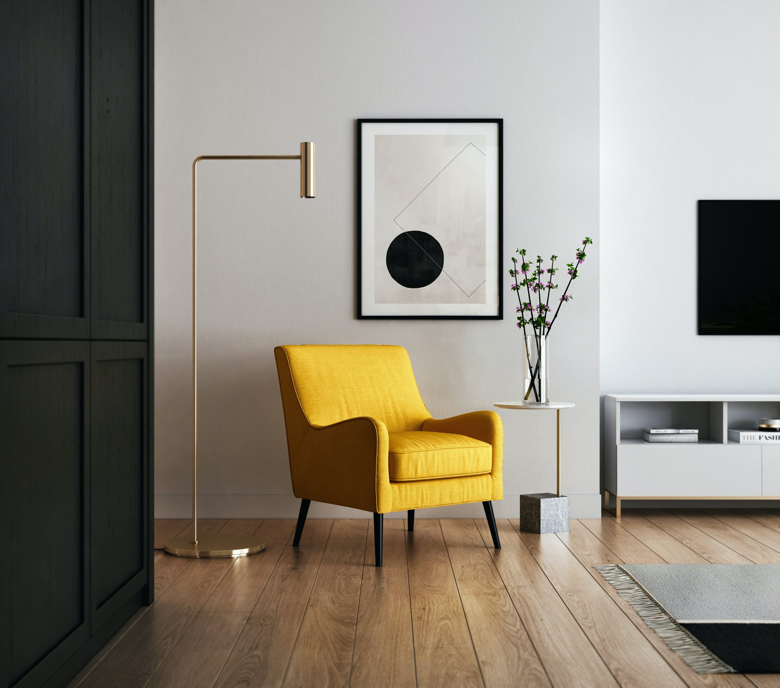
30. Sun-Kissed Yellows for Positivity: Yellows, reminiscent of sunlight, bring positivity to spaces. Consider them in kitchens or breakfast nooks for an uplifting and energetic vibe.
31. Cozy Browns and Earth Tones: Browns and earthy tones, reminiscent of natural elements, create a cozy and grounded atmosphere. Perfect for living rooms or areas meant for relaxation.
32. Elegant Grays for Versatility: Grays, ranging from light to charcoal, offer versatility. They serve as a sophisticated backdrop and allow other colors to pop in the decor.
33. Embrace Playfulness with Pinks: Pinks, from soft blush to vibrant fuchsia, add a playful and romantic touch. Suitable for bedrooms, nurseries, or any space where a touch of whimsy is desired.
34. Dive into Deep Jewel Tones: Jewel tones like emerald green, sapphire blue, and amethyst purple bring richness and sophistication. Use them in accents or statement pieces for a touch of luxury.
35. Crisp Whites for Freshness: Whites bring a sense of freshness and cleanliness to any space. They serve as an excellent canvas for showcasing artwork or introducing pops of color through accessories.
36. Serene Gray-Blues for Tranquility: Gray-blues strike a balance between serene blue and neutral gray. Ideal for bathrooms or bedrooms, they create a tranquil and sophisticated atmosphere.
37. Warm Oranges for Energizing Spaces: Oranges and warm coral tones inject energy and vitality. Use them in areas where you want to promote enthusiasm and social interaction.
38. Vibrant Turquoises for Coastal Vibes: Turquoise and aqua hues evoke coastal vibes. Perfect for bathrooms or spaces where you want to infuse a sense of freshness and relaxation.
39. Calming Beiges for Timeless Elegance: Beiges and muted taupes exude timeless elegance. They create a neutral backdrop that allows other design elements to shine.
40. Moody Blacks for Drama: Black, when used strategically, adds drama and sophistication. Consider black accent walls or statement furniture for a bold and modern aesthetic.
41. Harmonize Warm and Cool Colors: Balance warm and cool colors within a room. A mix of both creates a dynamic and visually appealing environment.
42. Create Accent Walls for Focal Points: Accent walls provide an opportunity to introduce bold colors without overwhelming the entire room. Choose a wall that naturally draws attention, like the one behind the bed or sofa.
43. Use Color to Define Zones: Use color to define different zones within an open-concept space. This creates visual interest and helps delineate functional areas.
44. Maintain a Cohesive Color Palette: While experimenting with colors, maintain a cohesive palette throughout the home. Consistency in color choices establishes a unified and harmonious look.
45. Reflect on Personal Preferences: Ultimately, reflect on your personal preferences. Your home is a reflection of you, so choose colors that resonate with your taste and make you feel comfortable.
46. Seek Inspiration from Nature: Nature is a master palette. Draw inspiration from landscapes, seascapes, and flora. Nature’s color combinations often harmonize effortlessly.
47. Consider the Impact of Artificial Lighting: Artificial lighting can alter the perception of color. Consider the impact of both natural and artificial light when finalizing your color choices.
48. Don’t Overlook Undertones: Undertones play a crucial role in color perception. Be attentive to whether a color has warm or cool undertones, as this can affect how it interacts with other elements.
49. Cohesive Color Story for Open Spaces: In open-concept spaces, maintain a cohesive color story. This ensures a seamless visual flow as the eye moves from one area to another.
50. Trust Your Instincts: In the end, trust your instincts. If a color speaks to you and feels right for the space, it’s likely to create the atmosphere you desire.
Choosing colors to decorate a room is a delightful journey of self-expression and creativity. Let the hues you select tell your story, evoke the desired emotions, and transform your living spaces into a canvas of personal style. Remember, there are no strict rules – only the colors that resonate with you and make your home uniquely yours. Happy decorating!
[/vc_column_text][vc_empty_space][vc_gallery type=”image_grid” images=”10876,10873,10869,10866,10863,10860,10854,10851,10825,10822,10813,10780,10703,10696,10694,10714,10712,10630,10626,10606,10609″ img_size=”300×300″][vc_empty_space][vc_column_text]Useful links | Interior Design | Interior Design company in Delhi NCR | Interior Design Cost in Gurgaon | Low budget interior designer in Gurgaon | Interior Design Firm | Interior Designer Ideas | Interior Designer in Noida Extension | Interior A to Z | Interior Designer in Gurgaon[/vc_column_text][vc_empty_space][vc_empty_space][vc_pinterest][vc_empty_space][vc_empty_space][vc_tweetmeme][vc_empty_space][/vc_column][/vc_row]