Introduction
Color plays a crucial role in modern flat designs. It helps to create a visually appealing and engaging user experience. Choosing the right color palette can make or break the overall design. In this article, we will explore some tips and considerations for selecting color palettes that work well with modern flat designs.
Understanding Modern Flat Designs
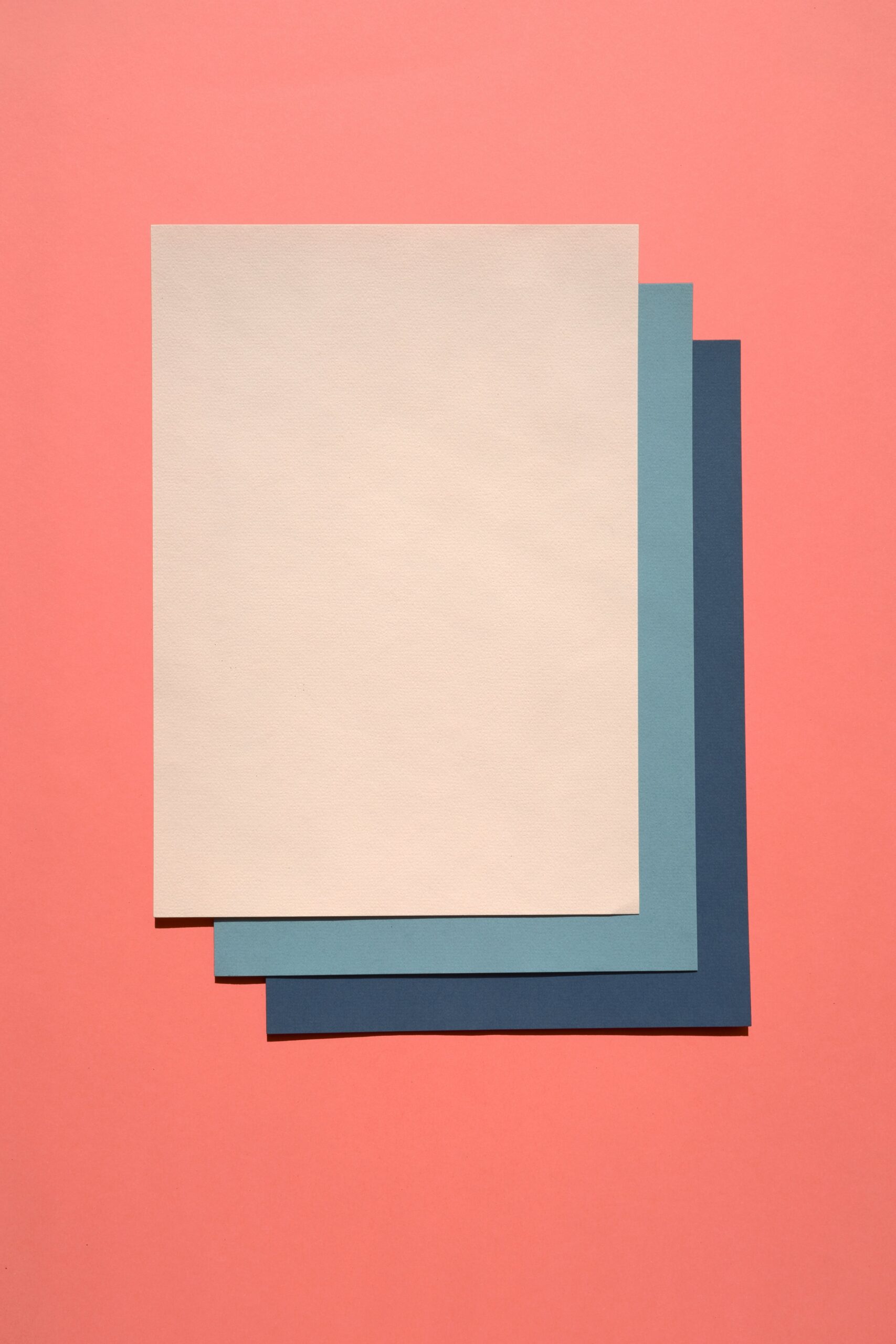
Modern flat designs are characterized by clean lines, minimalism, and simplicity. They often use bold and vibrant colors to create a visually striking appearance. Flat designs aim to provide a seamless user experience by focusing on simplicity and clarity.
When choosing color palettes for modern flat designs, it is important to keep in mind the principles of flat design. The colors should be bright, bold, and visually appealing. They should also complement each other and create a harmonious balance.
Color Psychology
Color psychology plays a significant role in design. Different colors evoke different emotions and can have a profound impact on the user’s perception and experience. When selecting color palettes for modern flat designs, it is essential to consider the emotions and feelings you want to convey.
For example, if you want to create a sense of energy and excitement, you might consider using vibrant and warm colors like red, orange, or yellow. On the other hand, if you want to convey a sense of calm and tranquility, you might opt for cool and soothing colors like blue or green.
Contrast and Hierarchy
Contrast is a crucial aspect of modern flat designs. It helps to create visual interest and hierarchy within the design. When choosing color palettes, it is important to consider the contrast between different elements.
Contrast can be achieved by using colors that are opposite each other on the color wheel, such as pairing a bright yellow with a deep purple. This contrast creates a visually striking effect and helps to differentiate between different elements.
Additionally, creating a hierarchy within the design is important to guide the user’s attention. By using contrasting colors for different elements, you can create a clear visual hierarchy that directs the user’s focus to the most important elements.
Color Accessibility
Accessibility is a crucial consideration in design. When choosing color palettes, it is important to ensure that the colors are accessible to all users, including those with visual impairments.
Colors should have sufficient contrast to ensure readability and legibility. It is important to consider factors such as color blindness and visual impairments when selecting color palettes. Tools like color contrast checkers can help ensure that the colors meet accessibility standards.
Inspiration and Resources
When selecting color palettes for modern flat designs, it can be helpful to seek inspiration from various sources. There are numerous online resources and tools available that provide color palette ideas and inspiration.
Color palette generators, such as Adobe Color and Coolors, can help you create harmonious color schemes based on a single color or a combination of colors. These tools can save time and provide a starting point for your design.
Additionally, exploring websites and designs that incorporate modern flat designs can provide valuable insights and inspiration for color choices. Pay attention to how different colors are used and the overall impact they have on the design.
Conclusion
Choosing the right color palettes for modern flat designs is essential to create visually appealing and engaging user experiences. By considering color psychology, contrast and hierarchy, color accessibility, and seeking inspiration from various resources, you can select color palettes that enhance your modern flat designs.
Remember, the key is to create a harmonious balance of colors that not only look visually appealing but also evoke the desired emotions and create a seamless user experience.


