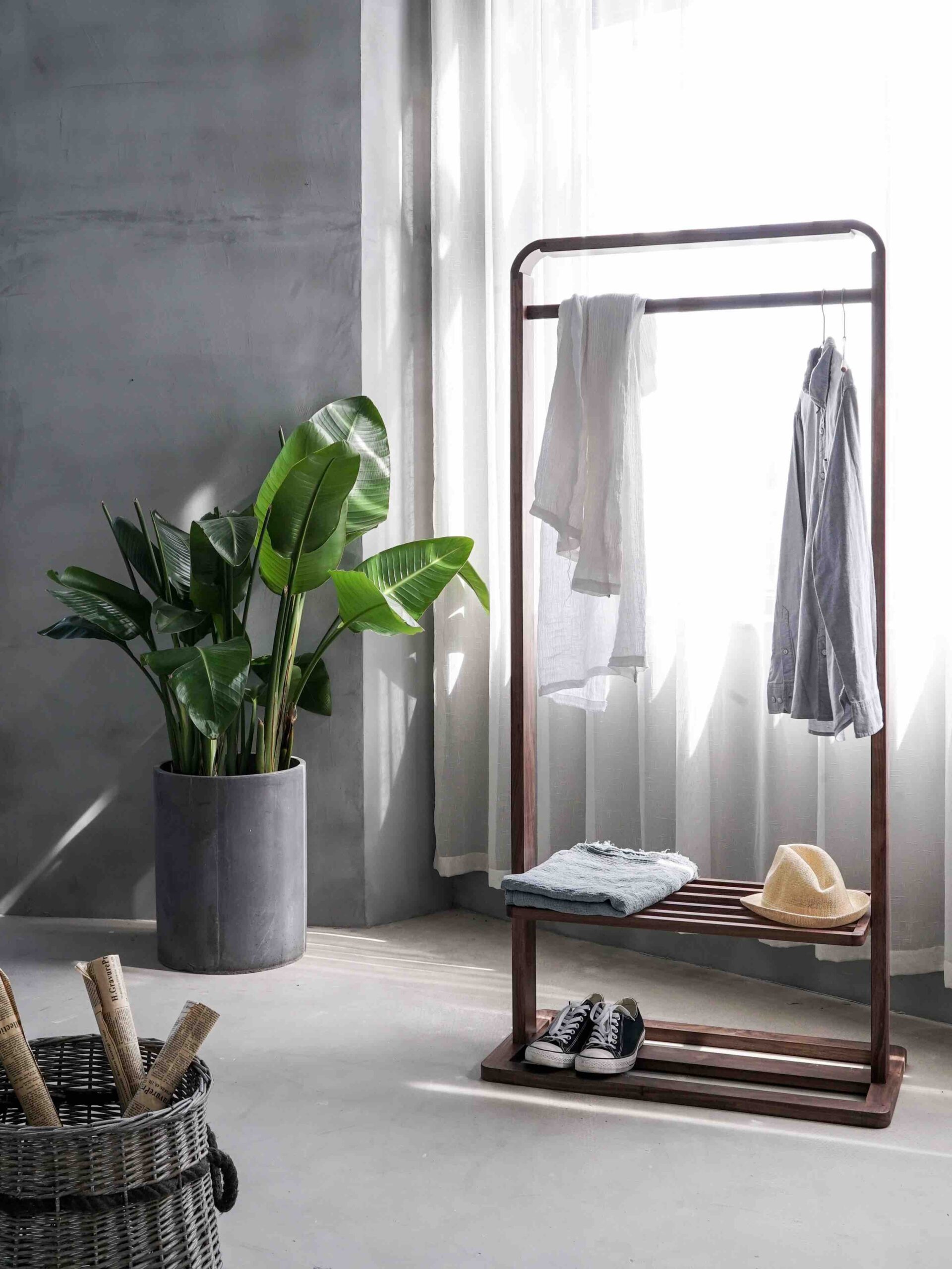
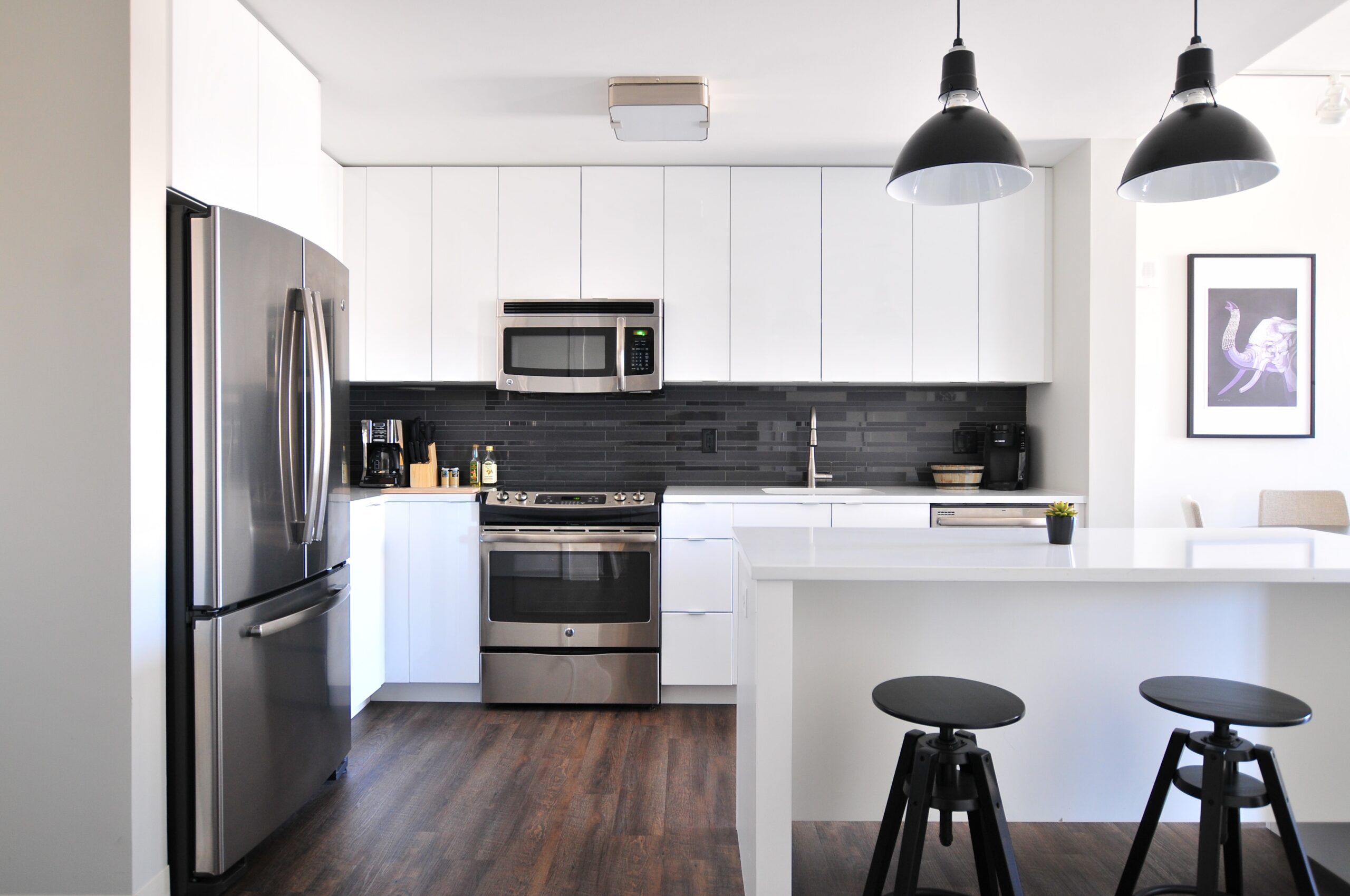
When it comes to interior design, finding the right balance of colors can make a significant difference in the overall aesthetic of a space. One popular guideline that designers often follow is the 60 30 10 decorating rule. This rule provides a simple and effective way to create a harmonious color scheme that is visually pleasing to the eye.
Understanding the 60 30 10 Rule
The 60 30 10 decorating rule is a concept that suggests dividing the colors in a room into three main components: 60% for the dominant color, 30% for the secondary color, and 10% for the accent color.
The dominant color typically covers the largest area of the room, such as the walls or the main furniture pieces. This color sets the overall tone and serves as a backdrop for the other colors in the space. It is recommended to choose a neutral or calming color for this role, as it provides a sense of balance and allows the other colors to stand out.
The secondary color, which makes up 30% of the color scheme, adds depth and visual interest to the room. This color can be used for upholstery, curtains, or larger accessories. It should complement the dominant color while adding a bit of contrast or variation.
The accent color, representing the remaining 10%, is the pop of color that brings life and personality to the space. This color should be used sparingly and strategically to draw attention to specific elements, such as throw pillows, artwork, or decorative accents.
Benefits of the 60 30 10 Rule
The 60 30 10 decorating rule offers several benefits when it comes to creating a well-balanced and visually appealing color scheme:
1. Simplicity:
The rule provides a straightforward and easy-to-follow guideline for choosing and combining colors. It eliminates the guesswork and ensures a cohesive look throughout the room.
2. Visual Harmony:
By dividing the colors into specific percentages, the rule helps create a sense of harmony and balance. The dominant color provides a sense of unity, while the secondary and accent colors add interest and contrast.
3. Versatility:
The 60 30 10 rule can be applied to any room or design style. Whether you prefer a monochromatic color scheme or a more vibrant palette, this rule can be adapted to suit your personal taste and preferences.
4. Flexibility:
While the rule suggests specific percentages, it doesn’t mean you have to adhere strictly to them. The key is to maintain a balance between the colors, but you can adjust the ratios slightly to fit your specific needs.
Applying the 60 30 10 Rule
Now that you understand the basics of the 60 30 10 decorating rule, here are a few tips to help you apply it effectively:
1. Start with the dominant color:
Choose a color that you love and feel comfortable with as the dominant color. This will set the foundation for the rest of the color scheme.
2. Experiment with shades and tones:
Play with different shades and tones within each color category to add depth and dimension to the room. This will prevent the space from looking too flat or one-dimensional.
3. Consider the room’s function:
Think about the purpose of the room and the mood you want to create. For example, calming colors like blues and greens are often used in bedrooms, while vibrant colors like reds and yellows can be energizing in a living room or kitchen.
4. Use the accent color strategically:
Choose a bold or contrasting color for the accent pieces to create focal points and draw attention to specific areas or objects in the room.
5. Don’t forget about texture:
Texture can also play a role in the overall color scheme. Consider incorporating different textures through fabrics, rugs, or wall finishes to add visual interest and depth.
By following the 60 30 10 decorating rule, you can create a well-balanced and visually appealing color scheme that enhances the overall aesthetic of your space. Remember, this rule is a guideline, and you can always make adjustments to suit your personal style and preferences.

